
 Mon–Fri: 10:00 – 18:00
  Request a call



Color Palette Generator
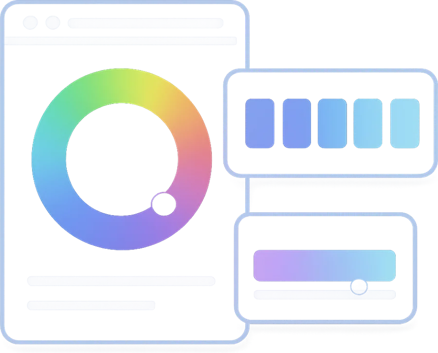
Picking a brand palette starts with one anchor color. From there, color theory offers several harmony schemes — complementary (opposite on the color wheel) for high contrast accents, analogous (neighbors) for unified feel, triadic for balanced variety. This generator builds all six common schemes from one base, plus a five-shade tint scale you can use as CSS variables.
How it works
Most B2B SaaS brands use monochromatic or analogous palettes — they feel professional and don't compete with content. Complementary is best for accent colors only (CTAs, alerts). Triadic and tetradic work for playful brands (creative tools, education) but rarely fit enterprise SaaS. Split-complementary is a safe in-between.
Most AI palette generators (Colormind, Khroma) optimise for design-trend aesthetics, not contrast or hierarchy. Always verify the palette against accessibility (run pairs through contrast checker) and against your actual product surfaces (cards, buttons, charts). A palette that looks great in isolation can fail in product.
Minimum five: one brand primary, one secondary/accent, one neutral text color, one background, one error/warning. Practically, design systems have 12-15 named colors with 5-9 tints each — Tailwind's default palette (50, 100, 200, ..., 900) is a good template.
Yes, and many B2B SaaS startups do. Tailwind's blue, indigo, slate, gray scales are well-balanced and WCAG-tested. The downside is brand differentiation — if your competitor uses the same Tailwind blue, you blend in. Use Tailwind as a base for neutrals, but generate at least one custom brand color via this tool.
 Download brief
  Print brief
Choose the most convenient way to contact us:
See what is holding your own page back
Paste a URL and get about twenty checks on the live page — indexing, meta, headings, markup, speed. Every finding on screen, the fixes by email.
Get a free UX review
Our senior designers review your site's UX, visual hierarchy, accessibility, and conversion flow — and send you a prioritised list of quick wins.